
Responsive Web Designer
Professional Responsive Website Designers
Websites which are desktop-focused are tough to use through phones and tablets. The best website needs an expert responsive website designer in place to appeal to the majority of users. Setting up a desktop-only site is just going to push you further and further down the rankings.
Whether you are looking to upgrade your existing website to a responsive website or you are looking for a completely brand-new responsive website, our qualified responsive web designers at Telsa Media can manage it all for you. With years of experience and resources, we can design, create and manage a responsive website for you for any possible device.
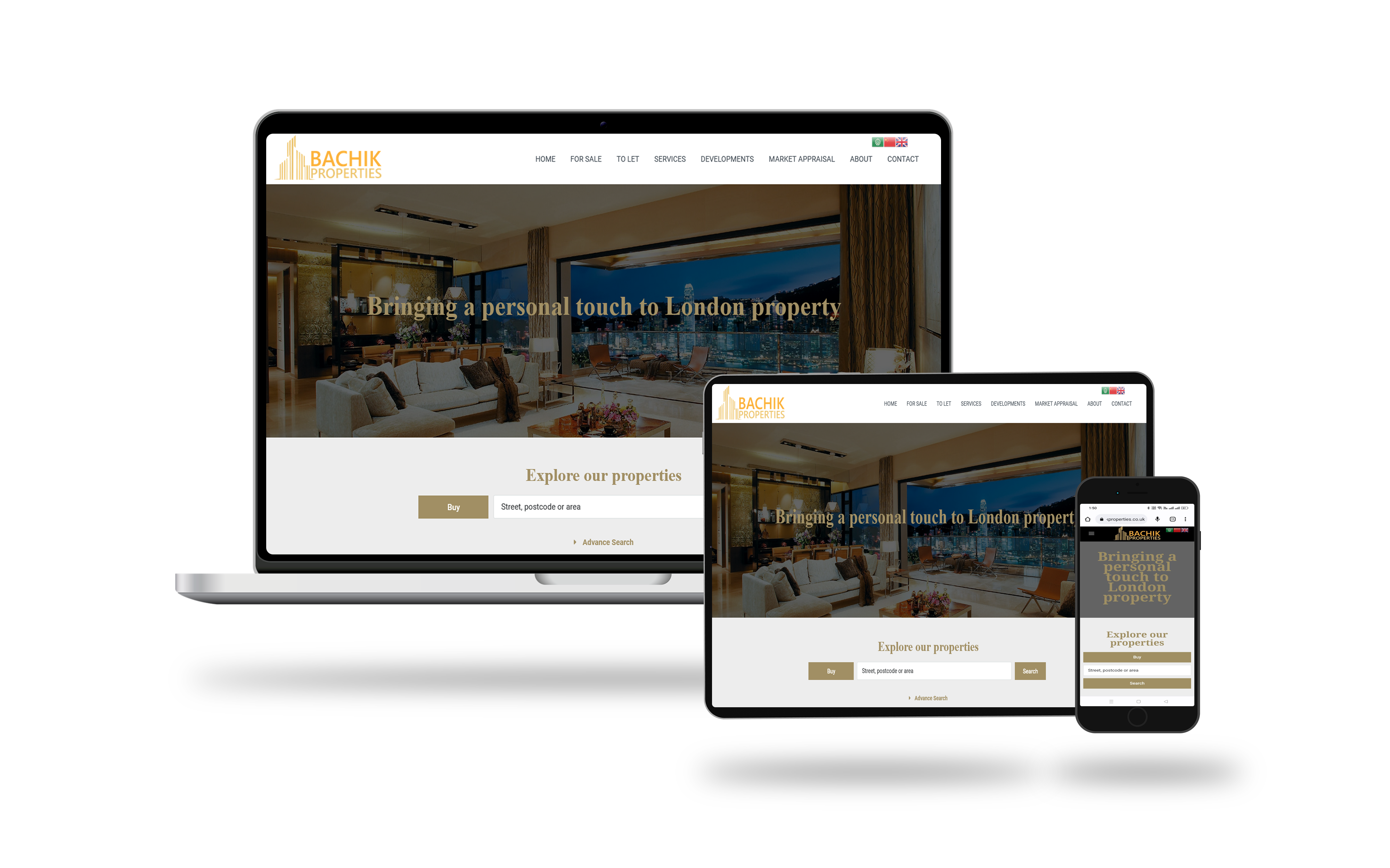
Responsive Web Design Company
What is a responsive website design? Do you need a responsive web design company to help with your website needs? If you’re unsure of what the latest trends in responsive design are all about, it’s a good idea to check out what you might be missing. It may not surprise you that more and more people are using their phones and tablets to visit the web than PCs and laptops these days!
Responsive Web Design Plans
Essential Website
£
249
- Upto 3 Pages Designed
- 12 Months Hosting
- 12 Months Domain (.co.uk)
- 24/7 Website Security
- SSL Certificate
- 1 Business Email Account
- Renew Next Year For Only £99
Premium Website
£
499
- Upto 3 Pages Designed
- 12 Months Hosting
- 12 Months Domain (.co.uk)
- 24/7 Website Security
- SSL Certificate
- 2 Business Email Account
- Renew Next Year For Only £149
Supreme Website
£
1200
- Upto 15 Pages Designed
- 12 Months Hosting
- 12 Months Domain (.co.uk)
- 24/7 Website Security
- SSL Certificate
- 5 Business Email Account
- Renew Next Year For Only £199
Mobile Responsive Website Design
As mentioned, more and more of us are searching and browsing the web through mobile devices. This means that there’s a greater need for the best responsive web development than ever before. Building a responsive website design and development means that you are ensuring your pages are easy to read and navigate across all handheld devices.
This means that you can create one web page, which will transform it onto multiple screens. It’s a great way to ensure that everyone can easily see what you have to offer, and you do not run the risk of alienating a whole portion of your audience.